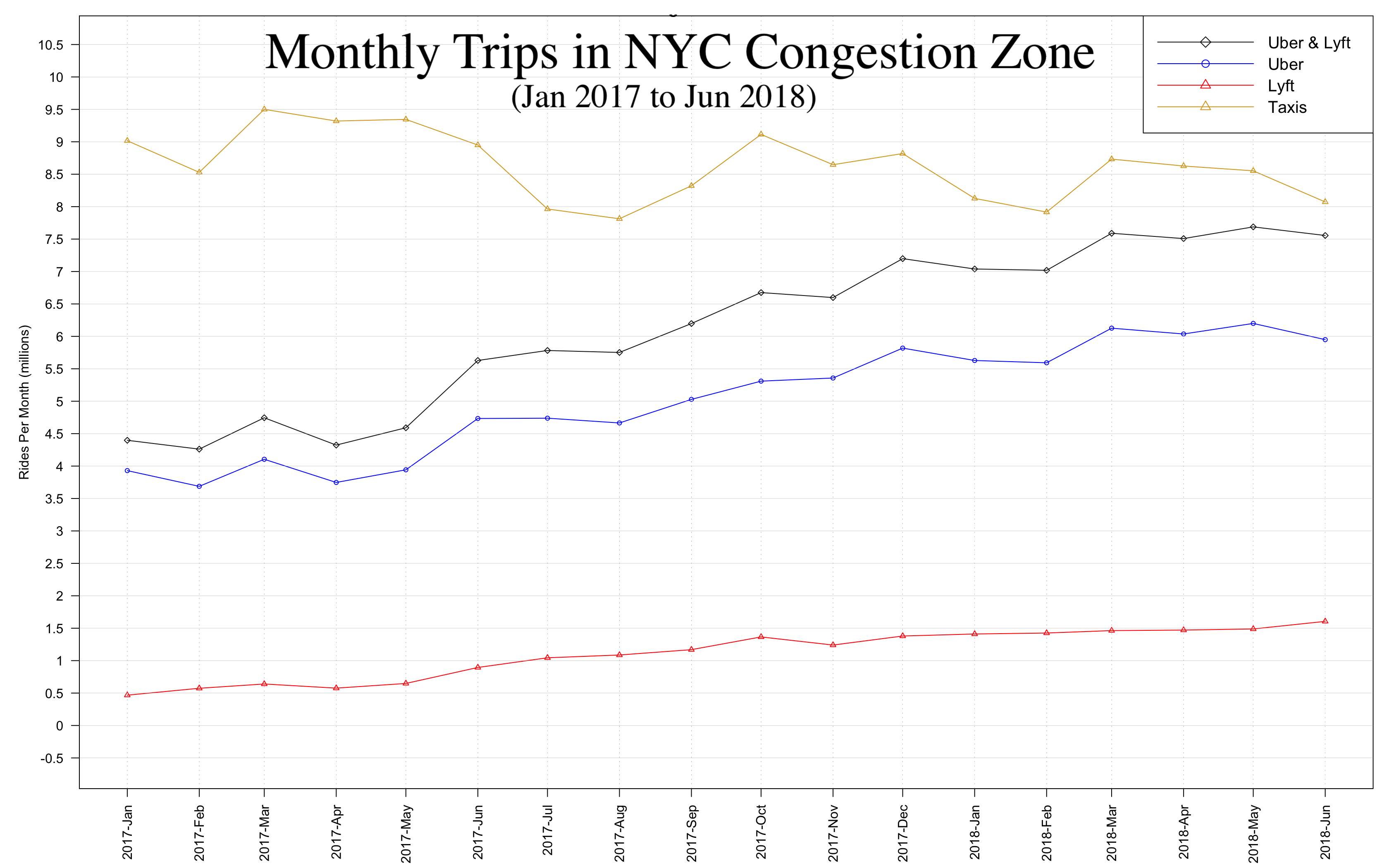
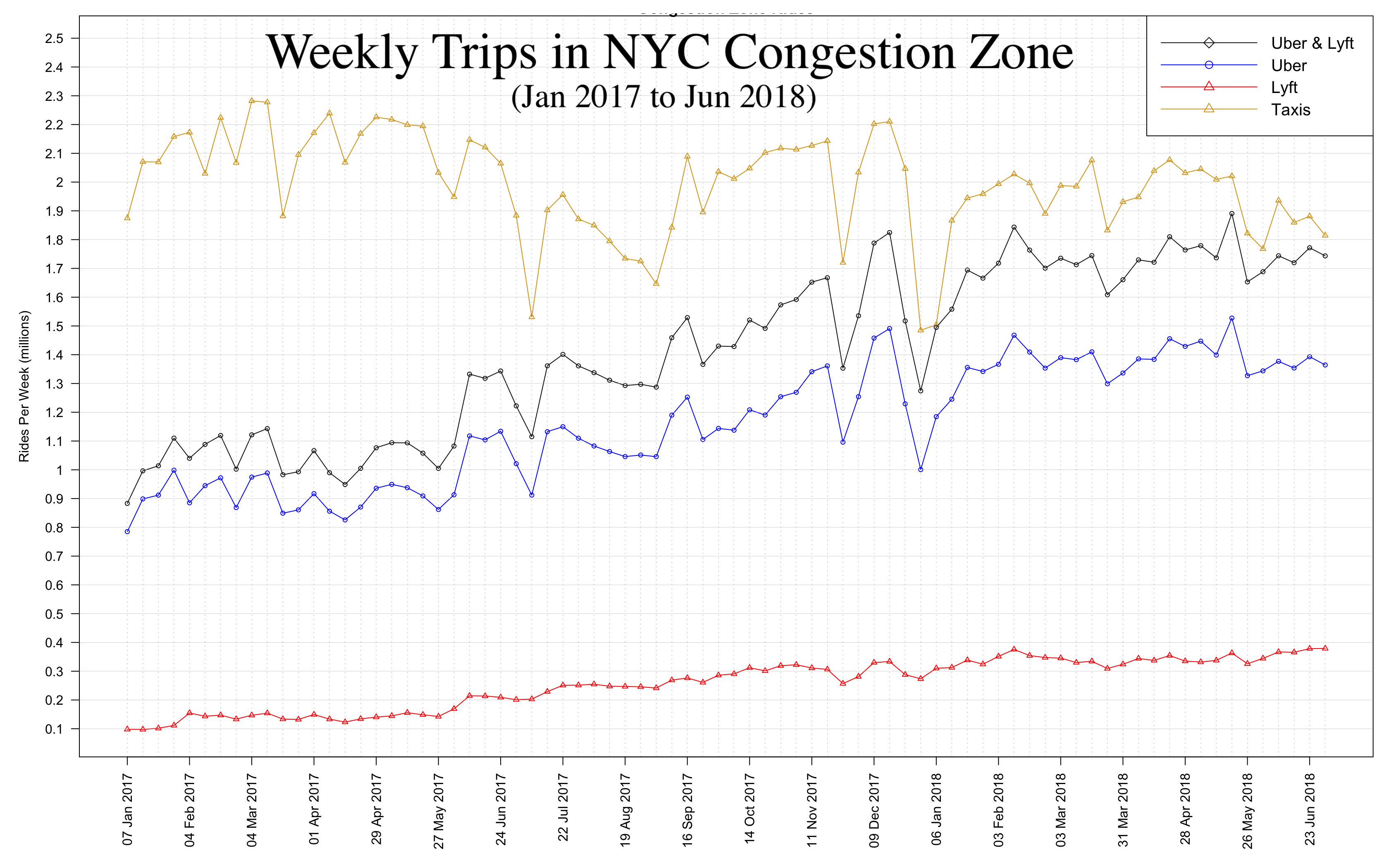
Graphs of for-hire vehicles ridership within Manhattan’s Congestion Zone from January 2017 to June 2018
As of Saturday, February 2, 2019 a new Congestion Surcharge came into effect. The surcharge is applicable to certain vehicles that carry people for hire whose trip starts, ends, or goes throught the "Congestion Zone". The Congestion Zone refers to the area in Manhattan south of and excluding 96th Street. The rate of the surcharge depends on the type of vehicle used. The surcharge is generally:
For more information refer to the following links: NY State Department of Transportation and Finance, WSJ, NY Times .
Note: Green Taxis, also known as Boro Taxis, were not taken into consideration for the graphs. The monthly average of Green Cab trips through the Congestion Zone was 151,580.3, equivalent to 16.59% of their monthly trips.

From this graph we can observe that – although Uber surpassed taxis monthly ridership in November 2017 – Taxis have the largest number of Trips within the Congestion Zone. Out of all the Taxi rides a monthly average of 92.81% would have incurred a Congestion Surcharge. In contrast only a monthly average of 48.95% Uber trips would have incurred in the Surcharge.

This graph shows the same information as the monthly graph, but it provides us with more granularity. With the increased granularity we can observe more volatility.
Some interesting developments to take into consideration observing this graph are:
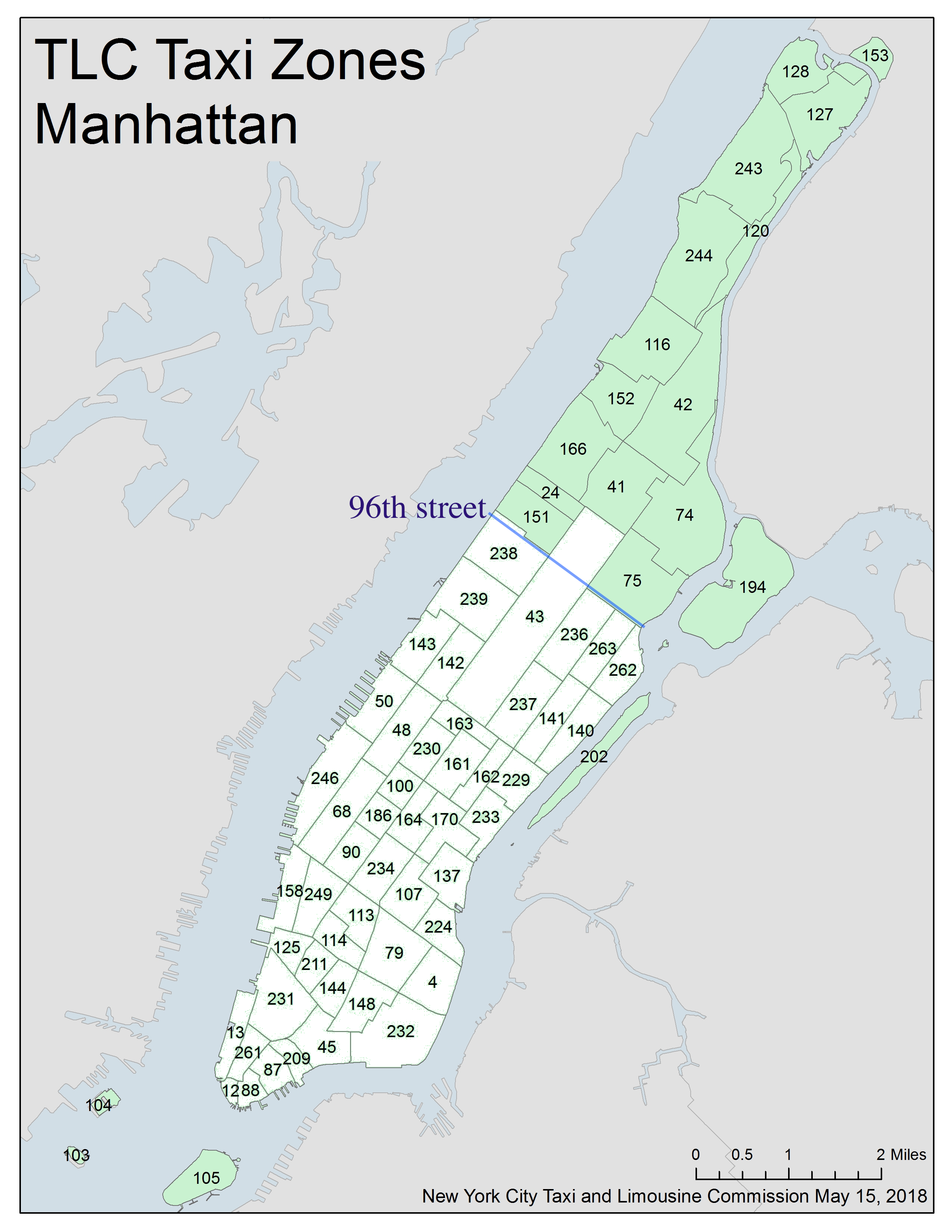
I assumed the Trips in the Congestion Zone to be only those that started or ended in any of the white colored zones of the map below.There was no clear way of knowing –from the data– if a Trip that started and ended outside of the Congestion Zone went through it, therefore this type of rides were not accounted for in the graphs

.
The trip data was obtained directly from the NYC Taxi and Limousine Commission.
The data was downloaded and processed using Python and Python Pandas.
The Graphs were created using R.