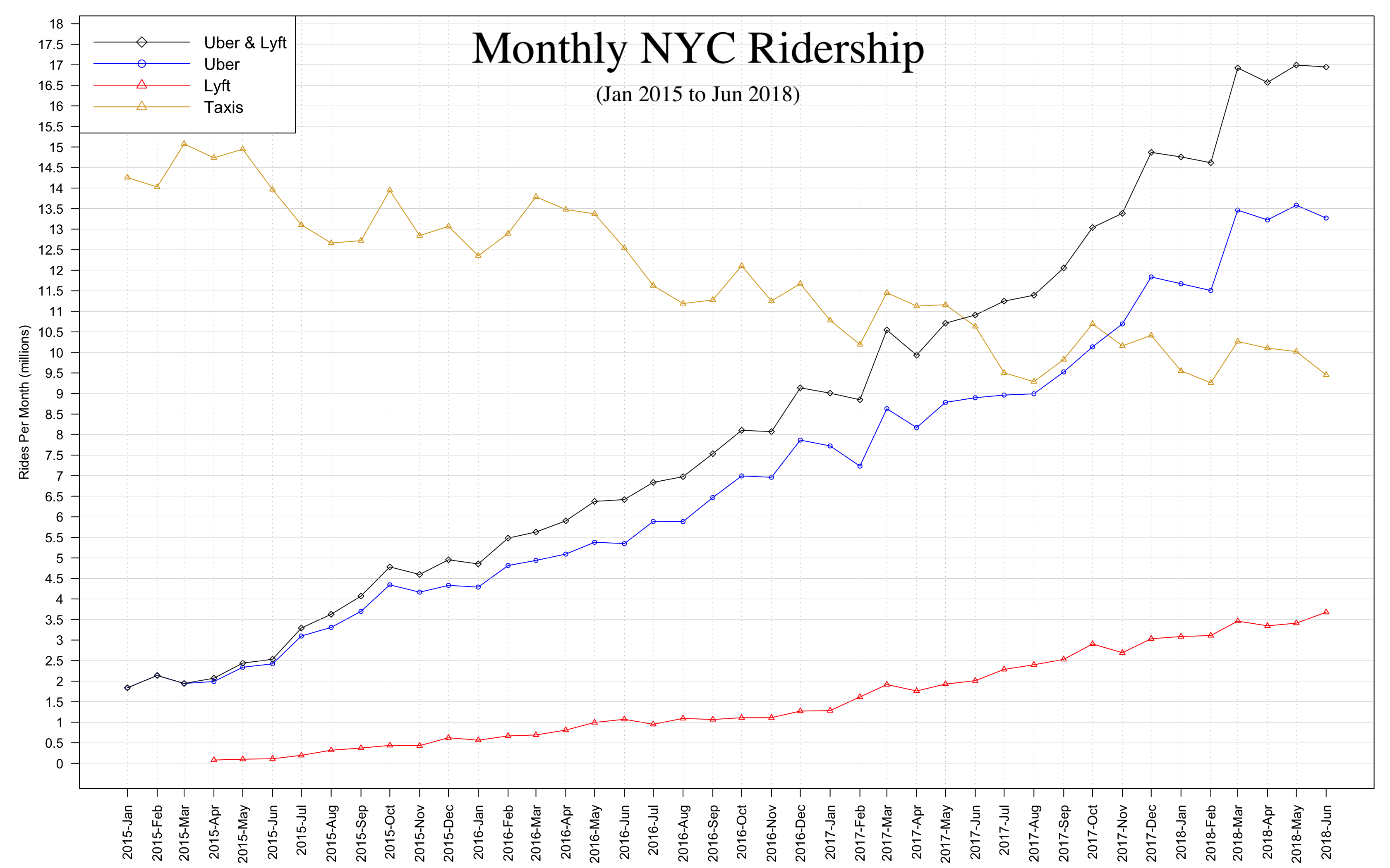
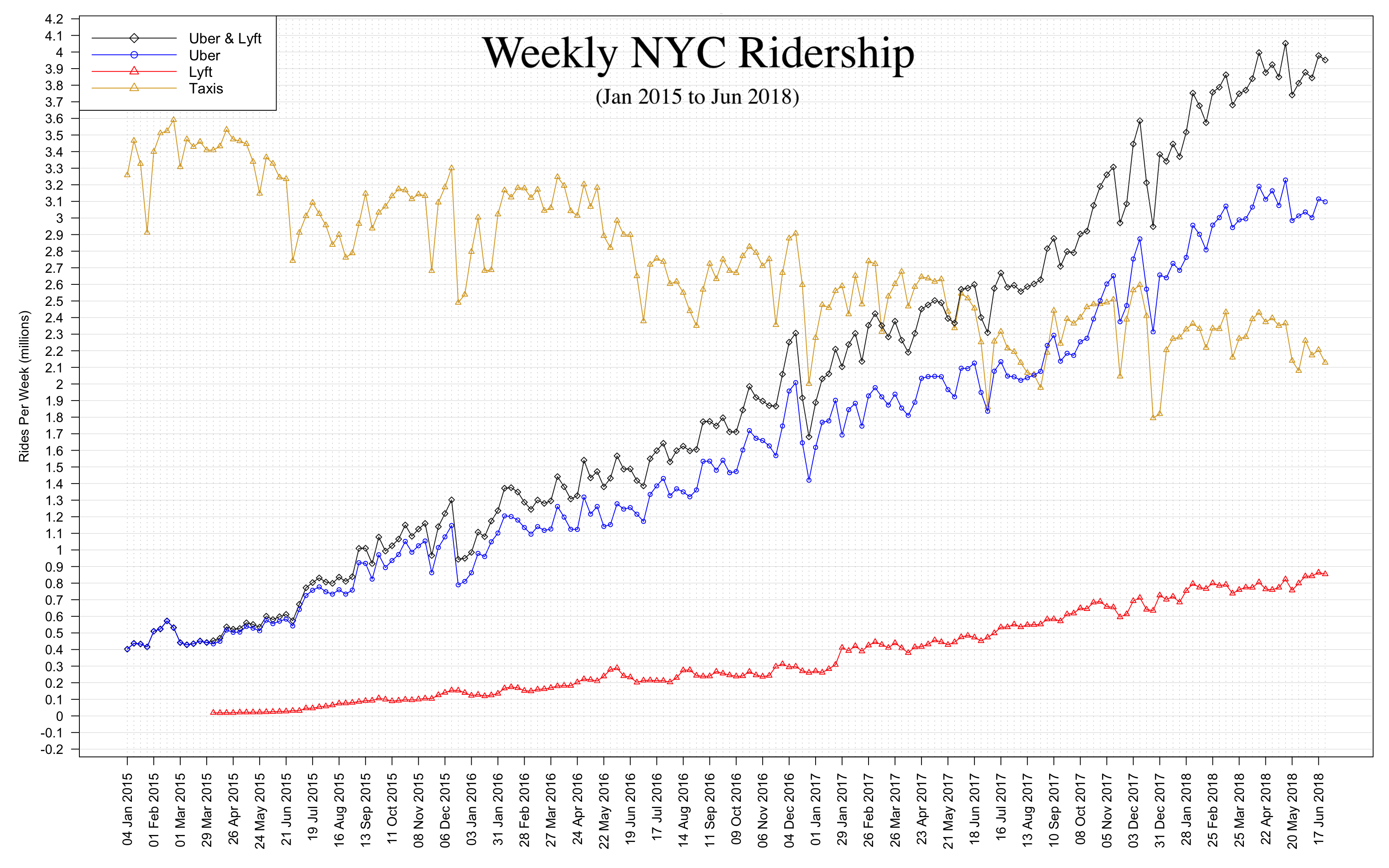
Note: Green taxis and Yellow taxis have been added together under "Taxis". Lyft data begins in April 2015.

Observations:
In November 2017 the number of monthly Uber trips surpassed that of Taxis
In May 2017 the number of monthly Uber + Lyft trips surpassed that of Taxis

Note about x-axis: The date on the x-axis refers to the number of trips of that day plus the ones that occurred in the following 6 days (a total of 7 days): e.g. 04 Jan 2015 refers to the number of trips that took place within and including January 4 and January 10, 2015.
The weekly graph contains the same information as the monthly graph, however by aggregating the trips by a smaller timeframe we can see more volatility. This increased granularity allow us to observe more clearly the effect that certain events had on these mediums of transportation.
Following are a couple of interesting dates:
The following graphs were made using TLC Trip Records Data.
The data (83 GB) was downloaded and processed using Python and Python Pandas.
The Graphs were created using R.